I’m biting the bullet and starting a blog…. So welcome to my first entry!
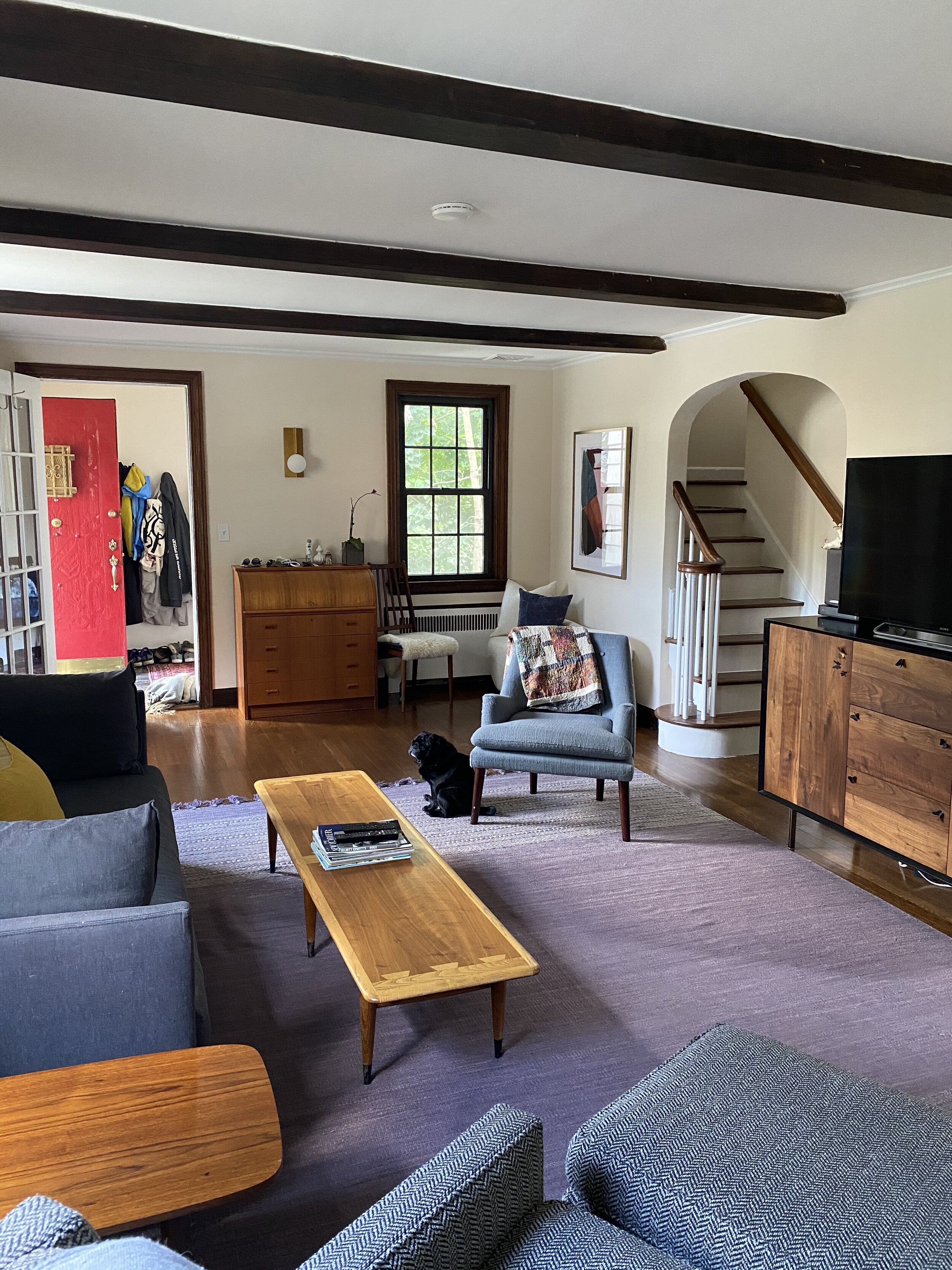
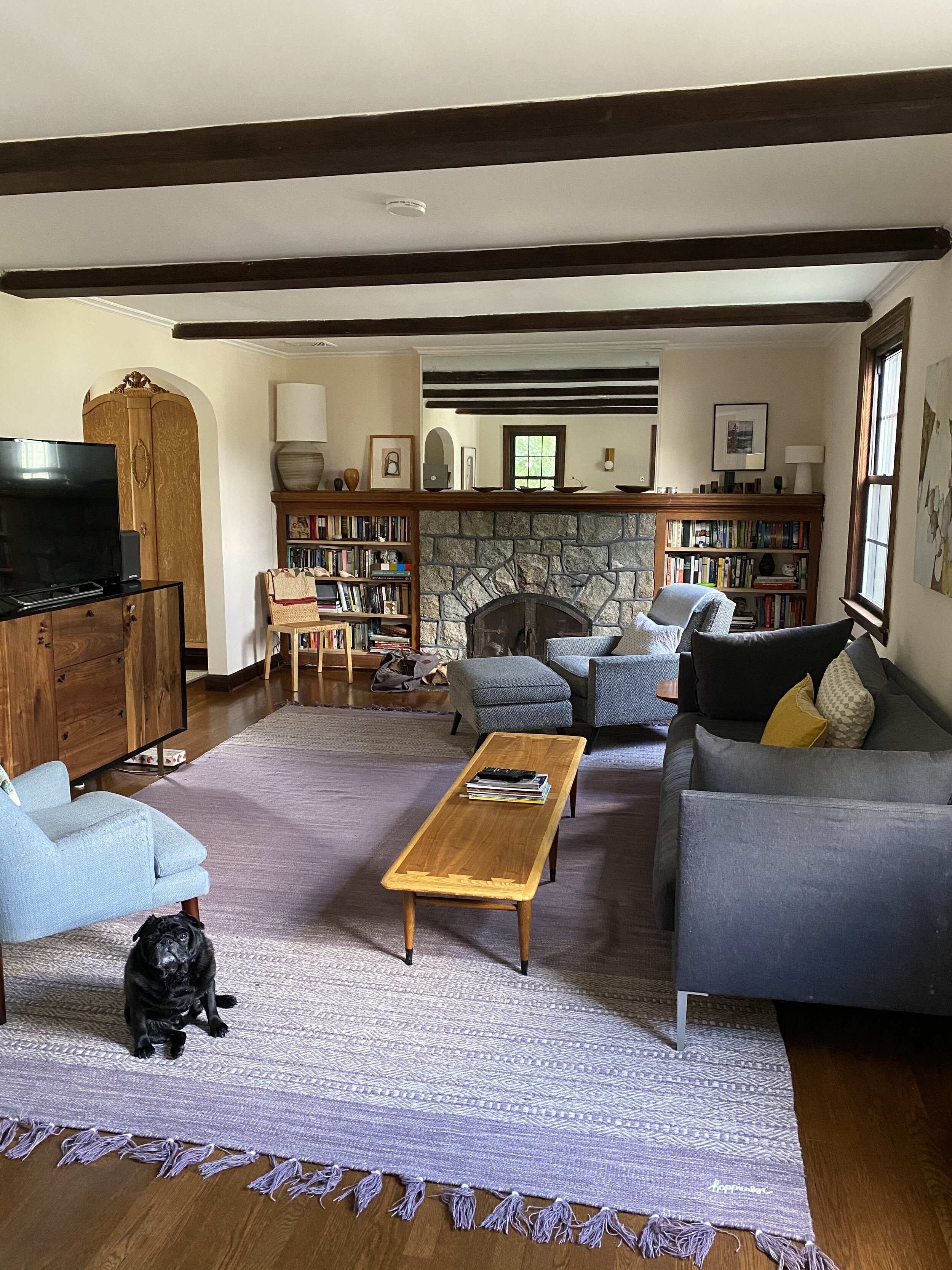
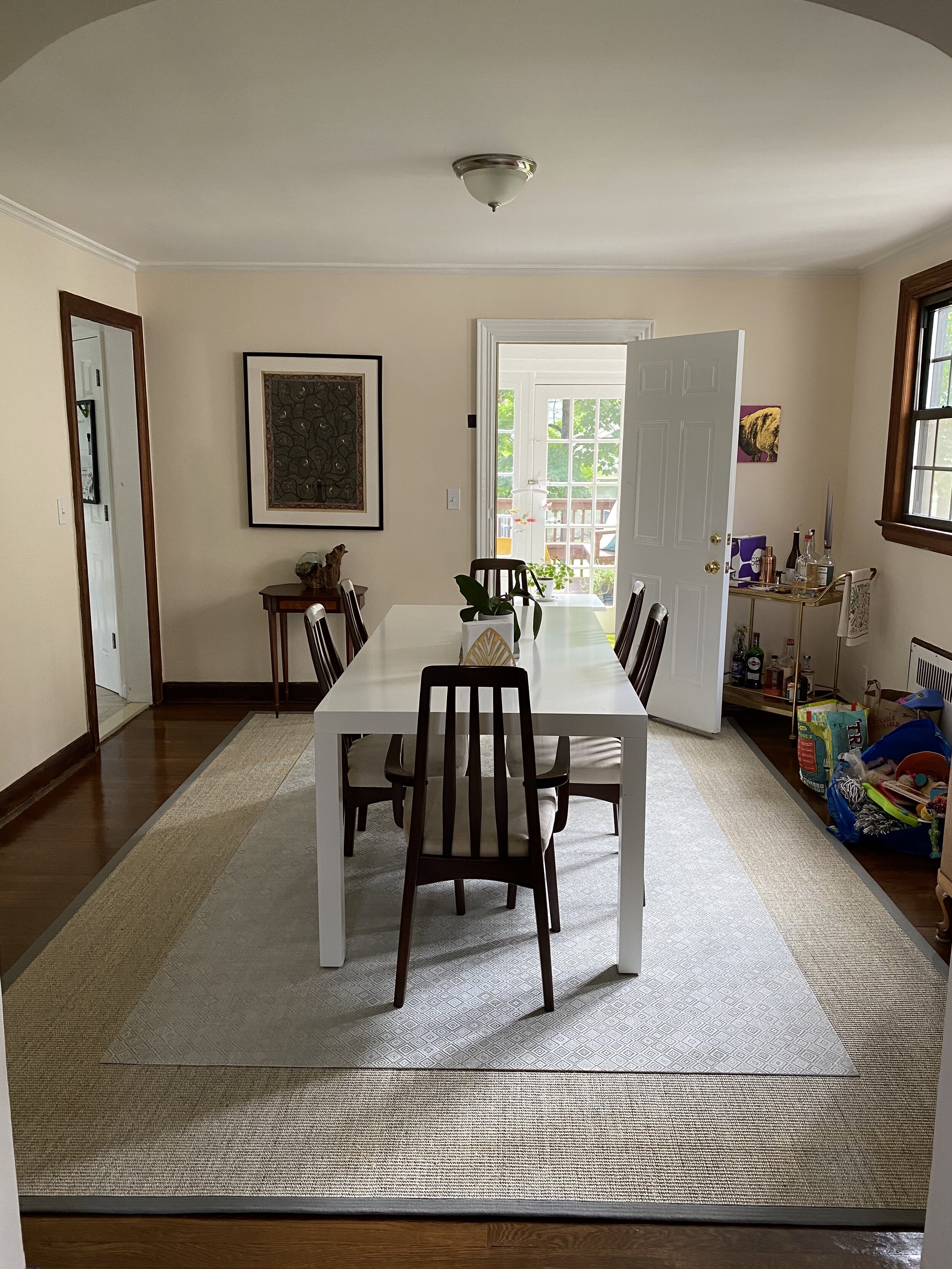
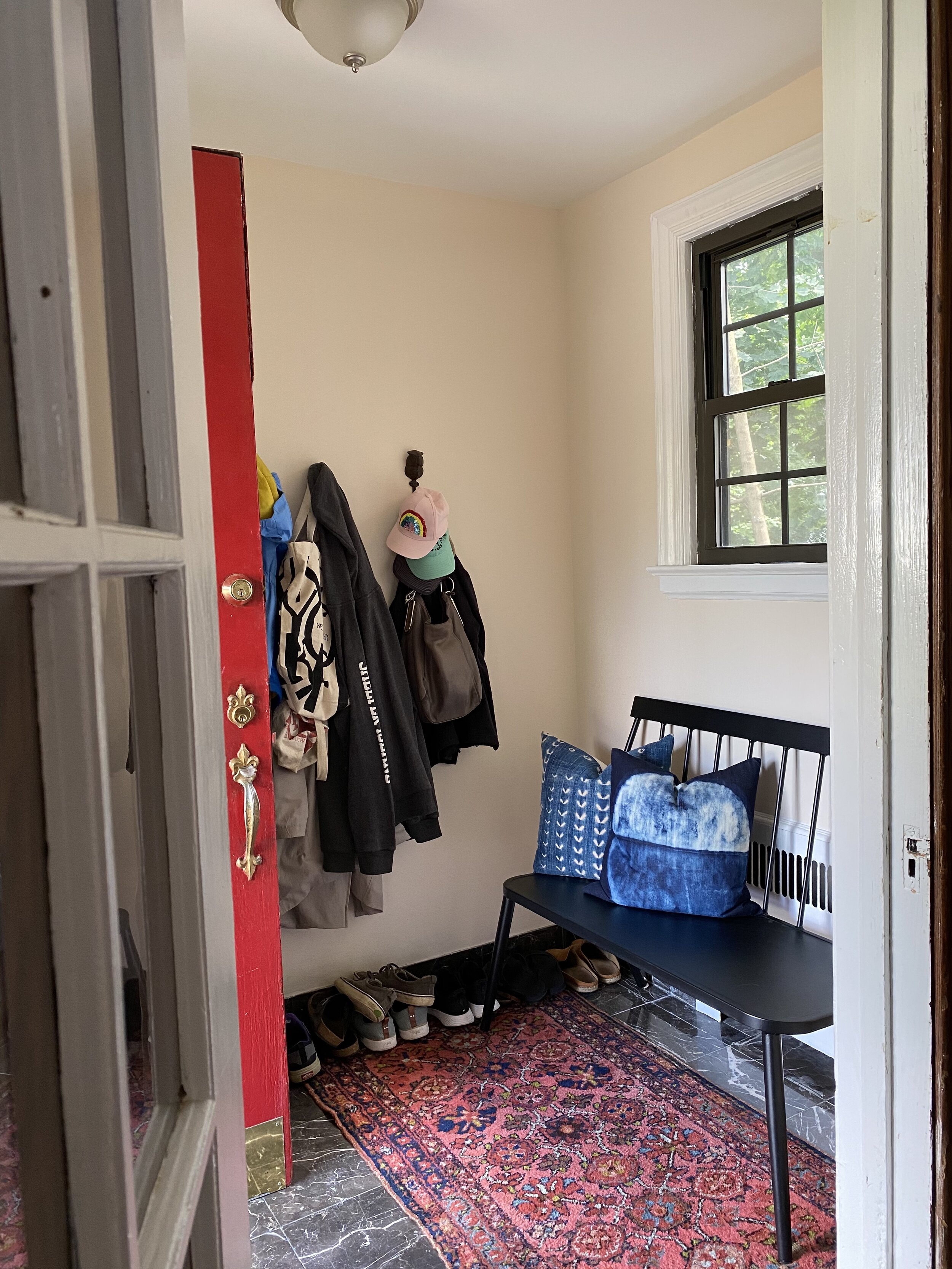
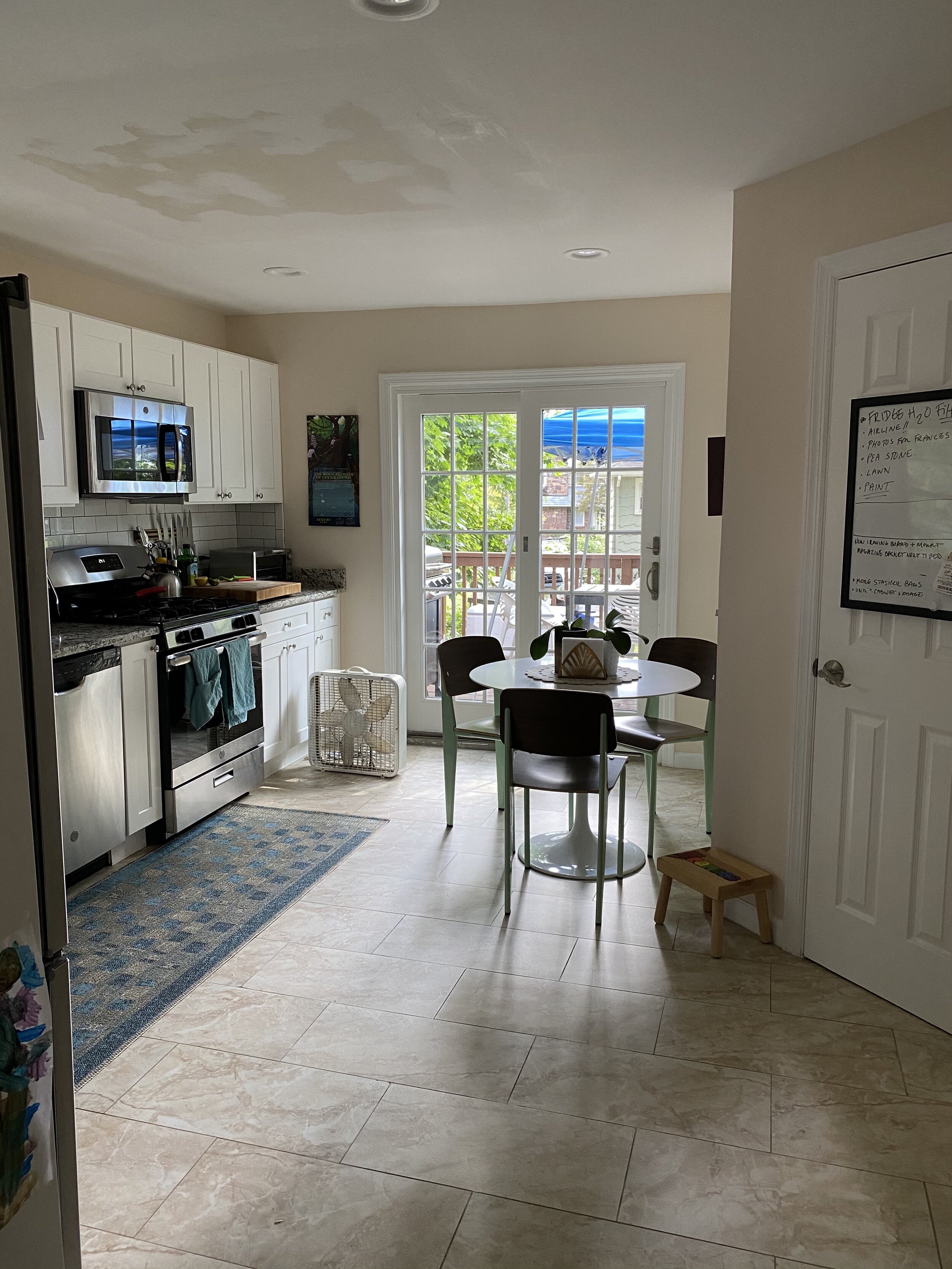
I figured I would stick to a topic that is close to home right now. I’m currently in the process of repainting the interiors of the 1937 Tudor revival my husband and I purchased last year. The interiors are currently painted light beige with white trim, aside from wood on a few doors and windows. It’s boring, bland and driving me crazy. But where do I begin to select colors? You would think, as a designer, this process would be a snap for me, but it’s not. There are so many variables to consider and so many beautiful hues to imagine. So I thought I’d take this opportunity to write about my process for deciding and hopefully give you some direction on how to decide for your own home.
How big is the room to be painted? Small to medium sized spaces have a lot of flexibility, but the bigger the room the more limited your palette typically is. You might love jewel toned walls, but painting your entire great room jungle green is hard to make work. Intense color or darker tones will be overwhelming in a large space. Stick to light, bright neutrals or pale hues so the architecture and interior elements have primary importance. In a smaller space you can decide if you want to be enveloped by the richness of color or have the walls recede. Saturated color tends to invoke more emotion and creates dramatic setting, but it can also make a space feel smaller. That’s not necessarily a bad thing though, just a consideration.
What is the style of the interiors? As a rule of thumb, modern interiors call for lighter, monochromatic color schemes (think shades of white and maybe grey or brown). Color, texture and pattern are brought in very thoughtfully and carefully. Perhaps a single wall is painted a bright, shiny blue, a ceiling is papered in a geometric pattern or the interior of a cabinet is cherry red. Generally, the colors will stay consistent from space to space and the walls and trim will be close in color, if not the same. If your taste runs more transitional or traditional it’s easier to bring in more color and more changes from room to room. These rules apply even if the architecture of your home is inconsistent with your taste. Painting the interiors of an old house in a monochromatic color scheme will give you a great backdrop to highlight modern furnishings and decor. It gets trickier with modern architecture and traditional decor, but it’s not impossible to pull off.
What mood or vibe do you want for the room? Do you want to feel light, bright and airy? Opt for white and light neutrals. Cozy and calm? Dark blues, green or grey. Cozy and warm? Try a rich terra-cotta, chocolate brown or aubergine. Bright pops of color tend to feel youthful and fun. Jewel tones, when done right, are elegant and sophisticated.
What fixed items and furniture pieces do you need to coordinate with? Take a look around the room and see what you can’t change or don’t plan to change any time soon. The color of your floor impacts the colors you can choose from for your walls. Cabinets, counters, tile, fireplace mantles and such all need to be taken into consideration. For example, I have tan and beige faux stone porcelain on the floors in my bathrooms and kitchen (which I hate). I’m not retiling anytime soon. I’d love to paint everything in cooler neutrals, but that will make the beige really POP, which is definitely not what I want. So instead I’ll pick a warmer white. The same applies to furniture pieces that you’re holding onto. If you own a blue sofa maybe burgundy walls isn’t the way to go. The only exception I make to this is art. Your art does not need to color coordinate with your home.
Is the space naturally bright or dark? This one’s pretty straightforward. What are the natural lighting conditions? Are there windows? Do they get a lot or a little natural light? A dark room, painted a dark color will be very, very dark. A light room, painted white will be very, very bright. Also consider the time of day you intend to use the space. Your dining room may get amazing southern exposure and feel great painted navy in the day, but if you don’t have sufficient artificial light at night you may find it hard to see your dinner plate.
Don’t pick your favorite color, pick what works best. You might really, really love aqua, but that doesn’t mean it’s the right color for every wall in your home.
Find cohesion and balance in your selections. I love rich, saturated color, but it won’t work in every room of my home. Too often I see homes that go from blue to yellow to tan to red to grey to white and so on. Or worse yet, the same bold color in every nook and cranny. And it can be just as bad when you’ve opted for the “contractor’s special” and painted every surface plain white (see exception for modern interiors). Try to remember that the rooms of your house should flow from one space to the next. It can be helpful to stay within the same color family for adjoining rooms. Look at the paint selections side by side - do they look nice together? Highlight a feature in one room by pulling the color of that item into the adjacent room. Or, if you don’t want to keep things consistent, look for clear divisions of space before making a major color transition (corridors, anterooms, framed openings, doors, etc). But keep the size of your home in perspective.
Well, that about sums up my process. It may feel overwhelming, but remember - it’s just paint! Easy to sample and easy to redo. I’ve posted some “before” photos of my first floor so you can follow me through this process and see the results. In my next installment I’ll be discussing how to pick the correct shade of the color you’ve selected.
Before images…

